How to Read YouTube Analytics in 2026: What Each Graph Actually Tells You
The morning after an upload, YouTube Studio hands you forty numbers, a grey arrow and a note that says the video is performing typically. None of it tells you what to change. Three charts do.
The retention curve points at the timestamp to cut. Click-through rate tells you whether the fault is the packaging, not the video. Traffic sources tell you who YouTube is showing it to. Everything else is a report card on a choice you already made.
Two things changed this year, and most analytics guides have not caught up. A view now counts from the first frame. The Audience tab splits returning viewers into casual and regular. Both get their own section below.
If the dashboard has never quite made sense, that is normal. Creators were still asking what impressions and click-through rate meant years after Studio launched. The metrics have been renamed and re-split several times since. This is the version of the dashboard that says what to do next.
What this guide covers, in order:
- The retention curve
- Reading the curve's shape
- Impressions and CTR
- CTR and retention on one grid
- Traffic sources
- The typical performance band
- New, casual and regular viewers
- The 2026 view-count change
- Average view duration
- Shorts: stayed to watch
The retention curve is the only graph that names a fix
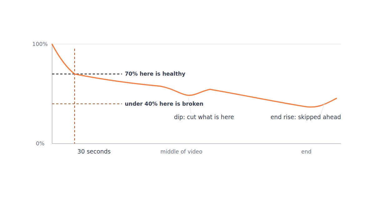
It points at a timestamp. The curve plots the share of viewers still watching against the position in the video. Every other chart tells you how a video did. This one tells you where to cut.
Judge the hook at thirty seconds. The rule that goes round creator forums matches what we see across the channels we cut for. A widely shared analytics cheatsheet says that if fewer than about 40% of viewers are still there at 30 seconds, the hook needs work. Holding around 70% means the hook is fine. Anything between the two is a reason to look at the middle of the curve before you touch the opening.
Starting below 100% is normal. Creators ask whether it is a bug every week, and it is not. Viewers who leave in the first second or two are gone before the first plotted point. So a curve that opens at 75% is telling you about the thumbnail, not the video. Judge the thirty second mark, not the first pixel.
Above 100% means rewatching. Retention of 200% means the average viewer watched a passage twice. On a short video, or a looping one, that can lift the whole line over the top. It is a good sign, not a glitch.
Read the curve by its shape
Four shapes, four edits. Four shapes cover almost everything you will see, and each one calls for a different edit.
Gentle slope
The video is working. Make more like it and leave the structure alone.
Early cliff
The opening is broken, or the thumbnail promised something else. Fix the first ten seconds.
Mid dip
People skipped something. Open the video at that timestamp and cut whatever is there.
Spike
People rewatched. Whatever is there is your strongest material. Do more of it, earlier.
Make reading the shape a habit. It is a habit rather than a skill. The creators who improve fastest open the curve on every upload and write down where the drop is before they plan the next video. That takes two minutes. It replaces most of the guessing about pacing.
An end spike is usually bad news. Creators see retention rising in the last ten seconds and assume the outro is a hit. It is usually the opposite. People skipped to the end for the result, which means the answer was buried too deep. The next video should deliver it sooner.
We act on the dip most often. Cutting videos at volume, it is almost never the whole section that is wrong. It is a passage where the camera stops moving and the sentence stops going anywhere. Thirty seconds of that costs more retention than a weak thumbnail costs clicks.
Impressions and CTR answer a different question
Two opposite problems. An impression is your thumbnail being shown. Click-through rate, or CTR, is the share of those that became a click. Together they tell you whether a weak video was turned down or simply never offered, which are opposite problems.
Take a real case. A creator who thought YouTube had stopped recommending their channel posted the numbers behind the worry. They had 438 impressions, a click-through rate of 8.7%, and an average view duration of 6:16.
A reach problem, not a quality problem. Nearly 9% of the people shown the video clicked, and they stayed six minutes. There were only 438 impressions to work with. Rewriting that video would fix nothing. The creator would have spent a weekend learning the wrong lesson.
Check impressions before you judge views. This is the single most useful reflex to build. A video with 400 impressions has not been tested. A video with 40,000 impressions and a 2% CTR has been tested and turned down, and the thumbnail is the thing to change.
CTR is not a clean ratio. Studio's impression count leaves out some surfaces that the view count includes. So the reported rate understates real click-through by an amount nobody outside YouTube can measure. Compare CTR against your own other videos, not against a figure from someone else's channel.
Put CTR and retention on the same grid
Neither number means much alone. Read together they sort every video into one of four cells, and each cell has its own fix. Keep this diagram open when you decide whether to touch the thumbnail or the edit.
Creators draw the same grid. Those who track their own uploads this way end up in the same place. One travel channel's action list boils it down to one line. A high CTR with low retention means a problem with the hook, the content, or how the packaging lines up with the hook.
The bottom-right cell is the expensive one. YouTube treats a click that does not turn into watch time as a broken promise. Creators who have watched a clickbait-shaped result get a video promoted less are describing exactly that.
Only the top-right cell grows a channel. Every viral case study creators post comes down to the same pair: a high click rate and a high view duration on the same video. No other cell grows a channel on its own.
Bottom-left is usually no data. Low CTR and low retention on a video with a few hundred impressions is not two problems. It is no data. Wait for the impressions, or accept that the video was never offered. Do not rebuild it on a sample that small.
Traffic sources tell you who is being shown the video
A description of reach, not a scoreboard. This is the chart creators most often misread as a scoreboard. It describes who YouTube is showing your video to.
Browse is bigger than it sounds. It contains Home, watch history, Subscriptions, Watch Later, Trending and personalised playlists. That is almost every surface a person sees when they open YouTube without a video in mind. Suggested is the sidebar and the autoplay queue next to someone else's video. Search is people who typed the topic.
Browse knows you, Suggested does not. Browse is mostly people who already know you. Suggested is mostly people who do not. Creators who have grown past the point where subscribers can carry a video treat Suggested overtaking Browse as the moment a channel starts to work, and that is a fair reading.
Mostly Browse means a capped channel. Suggested traffic means the video is being placed beside strangers' videos and chosen. A channel whose traffic is nearly all Browse is being served to the people it already has. That is why the view count feels capped.
The mix varies more than any benchmark admits. Large channels are widely said to get as much as 70% of their traffic from Suggested. A small channel in the same discussion reported Suggested at 4%, with Browse as its largest source. Neither is a target. The number to watch is whether your own Suggested share is growing.
Read CTR per source. Do not read it as one channel figure. A common pattern is a decent Browse CTR beside a poor Suggested one, and it has a specific meaning. The thumbnail works for people who recognise you and fails in a sidebar full of strangers. That argues for higher contrast and a clearer subject, not a different video.
The typical performance band compares you with yourself
The grey band is your own history. Open any video in Studio and the first chart shows a line for this video inside a grey band. The band is the range your own recent uploads fell in over the same number of days. It is the most misread chart in the product, because people assume it is a benchmark for their niche.
Typical means typical for you. Studio labels the band Typical Performance (Last 10 Videos). That label answers the question creators keep asking. The band is built from the history of your previous videos, and nothing wider.
Above the band beats your last ten. A line above the band means this video beat your last ten. It does not mean the video is good by any outside measure. A line below the band on a channel that just had a hit is the hit distorting the band.
Studio's own sentences say so. Read them literally. One creator pasted theirs, and it said the video was reaching a smaller audience than usual while its click-through rate was similar to its typical performance. That is a note about reach, not a verdict on the video.
Two cautions for 2026. The band goes strange after a viral video. It has also had at least one bug this year, with creators reporting videos at fifty times their normal views still marked as typical. When the band says everything is typical, ignore it for two weeks and read raw impressions and CTR instead.
Audience by watch behaviour: new, casual and regular
Returning viewers are now two groups. Studio used to split a video's audience into new and returning viewers. In 2025 it split returning into casual and regular. The Audience tab now shows three groups under Audience by watch behaviour, with See more and Add comparison to set two videos side by side. The split matters because the three groups click at very different rates, and Studio shows CTR and view duration for each.
Two real channels, two worries. Channel A belongs to a creator asking whether 80.8% new viewers is normal. Channel B belongs to one asking how to fix a video with 2% new viewers, 39% casual and 58% regular. Both posted their split as a problem, and both were half right.
Neither split is wrong on its own. A is what a channel looks like while YouTube is testing it on strangers. The number to watch there is whether casual grows over the next month. B is what a channel looks like when the test has stopped. The number to watch there is CTR among new viewers.
Per-group CTR shows the problem. One creator whose channel had stalled at its peak found regulars clicking at 12% and casual viewers at about 6%. When regulars click at double the rate of everyone else, the thumbnail is trading on recognition. It will not survive being shown to strangers. It is the same diagnosis as a low Suggested CTR, reached from a different chart.
The forums disagree, usefully. One camp says returning viewers are what push a new video into recommendations. The other says an individual video should reach as many new viewers as possible. Both are right at different scales.
Grow regulars over months, new viewers per upload. Regulars are a channel number to grow over months. New viewers are a video number to grow per upload.
Views changed meaning on 24 August 2026
A view now starts at the first frame. This is the change that makes older analytics guides wrong. On 24 August 2026 YouTube started counting a view from the first frame for long-form video and live streams. Shorts had already worked that way since 2025.
The old number is now engaged views. TechCrunch reported the announcement. The old definition, which needed a viewer to actually stay, lives on under the name engaged views. Earnings and Partner Program eligibility still run on it.
Dashboards jumped overnight. Small channels reported the new count almost quadrupling their views. The old number reappeared under the name engaged views in Advanced Mode.
Views are the new impressions. One creator summed up the change as views becoming impressions and engaged views becoming views. So read the public count the way you used to read impressions, as a measure of how widely YouTube served the video. Read engaged views the way you used to read views.
It broke a habit too. Creators used to watch real-time views in the first hour to decide whether to swap a thumbnail. They are now asking whether real-time tweaks are possible at all, because the number now includes everyone who scrolled past with autoplay on. Real-time views were never a reliable signal. Judge a launch on the retention curve and on CTR, which the change did not touch.
Two practical consequences. First, any comparison of views across the 24 August line is meaningless. Compare engaged views when you look at a video against your older uploads. Second, the CTR on the Content tab is still impressions to clicks, so it did not move. It remains the honest number for whether the thumbnail works.
Average view duration is not a comparison number
Only one of the two is fair. Studio shows two versions of the same idea: average view duration in minutes, and average percentage viewed. They rank your videos in different orders.
Ten minutes can be weak. Video A belongs to a creator who had been making videos for fifteen years and still found the pair confusing. The video had 539,000 views, an average view duration of 10:43 and 18.5% viewed, on a runtime of 57:50. A ten minute view duration would be superb on a twelve minute video. It is a weak hold on an hour.
The trap works in reverse too. A creator who shortened their videos watched percentage viewed rise while average view duration fell. They had to decide which number to believe. They had improved the video. One of the two metrics said otherwise.
Compare with the percentage. Use it to compare videos with each other and to judge an edit. Use the duration only for what it is: total minutes YouTube can sell ads against. That is why long videos with poor percentages still earn.
Shorts have a different first chart
Read stayed to watch first. On a Short the retention curve is the second thing to read. The first is the split between viewers who stayed to watch and viewers who swiped away. A swipe still counts as a view, so the view count alone will not tell you the opening failed.
The bar comes from a real Short. A creator logging a Short hour by hour saw 66% stayed to watch in the first hour, with a 20 second average view duration on a 21 second video. The view count on its own would have hidden any problem. A swipe still registers as a view and only shows up as a lower stayed-to-watch percentage.
The floor is creator lore, but consistent. There is no published rule for where it sits. Creators who get Shorts into the feed at scale tend to report stayed to watch above 50% with retention over 100%. The ones asking why a Short died are posting ratios like 17 to 83.
Delete everything before the first word. When we recut a Short that loses more than half its viewers to the swipe, the first edit is always the same. We delete everything before the first spoken word or the first movement, so the frame under the thumb is already the video. A logo, a title card or a breath in costs more on a Short than anything after it.
What to do about each pattern
| What you see | What it means | What to do next |
|---|---|---|
| Retention under 40% at 30 seconds | The opening is losing people before the video starts | Rewrite the first ten seconds to answer the thumbnail immediately. Cut any intro animation. |
| Retention near 70% at 30 seconds | The hook works | Change nothing here. Look at the middle instead. |
| A sharp dip mid video | People skipped a specific passage | Open the video at that timestamp. It is usually a tangent, a sponsor read or a slow demonstration. |
| A spike mid video | People rewatched a specific passage | That is your strongest material. Put that kind of moment earlier in the next video. |
| High CTR, low retention | The thumbnail wrote a cheque the video did not cash | Keep the thumbnail style, fix the opening so it delivers what was promised. |
| Low CTR, high retention | Good video, nobody is clicking | The video is fine. Work on title and thumbnail contrast. |
| Impressions rising, views flat | You are being shown and not chosen | A packaging problem, not a content problem. Do not rewrite the video. |
| Mostly Browse traffic | Your existing audience is watching | Normal for a small channel. Suggested growing is the signal to watch for. |
| Line above the typical band | Better than your own last ten videos | Work out what this one did differently and repeat it. The band says nothing about your niche. |
| Mostly regular viewers, few new | YouTube has stopped introducing you to strangers | Look at CTR for new viewers specifically. It is usually the thumbnail failing next to strangers' videos. |
| Views jumped after 24 August 2026 | The public count now starts at the first frame | Nothing changed in the video. Compare engaged views in Advanced Mode against your older uploads. |
| Short with under 50% stayed to watch | The first second is losing the swipe | Cut everything before the first spoken word or the first movement. |
The numbers to stop looking at
- Subscriber count. It includes people who clicked once and have not watched in a year.
- Real-time views in the first hour. The sample is too small to mean anything, and since 24 August 2026 it counts every autoplay.
- Public view count on its own. Use engaged views in Advanced Mode when you are comparing videos.
- Average view duration on its own, because it moves with video length. Use the percentage.
- Any benchmark from another channel in another niche. Compare against your own back catalogue, which is what the typical performance band already does.
- Impressions, as a goal in itself. Impressions with a poor CTR are being shown and refused.
The last one catches people out most. Rising impressions feel like progress. Often they are just YouTube widening the test. That reverses within two weeks if the click rate does not hold.
A twenty minute routine, once a week
- Open your newest video. Note retention at thirty seconds and compare it to the last three.
- Find the sharpest dip. Open the video at that timestamp and write down what is there.
- Check impressions before judging views. Under a few thousand, the video has not been tested.
- Place the video on the CTR and retention grid above, and let the cell choose what you change.
- Compare CTR against your own median, not against a number from a blog.
- Check whether Suggested traffic and new viewers are growing as a share. That is new audience arriving.
- Do one thing differently in the next video. One, so you can tell what caused the change.
Change one thing per video. That rule is the one that turns analytics into progress. Creators who change the thumbnail style, the intro and the length at once learn nothing from the result. Three variables moved, so the outcome cannot be pinned on any of them.
The short version
- Retention at thirty seconds: under 40% the hook is broken, near 70% it works.
- A curve starting below 100% is normal. Above 100% means rewatching.
- Dips point at a timestamp to cut. Spikes point at material to do more of.
- An end rise usually means people skipped ahead for the answer.
- Check impressions before concluding anything from views.
- CTR and retention together put every video in one of four cells, and only one cell means recutting.
- The typical performance band is your own last ten videos, not your niche.
- Browse is your existing audience. Suggested growing, and new viewers growing, is new audience.
- Since 24 August 2026 the public view count starts at the first frame. Engaged views is the old number.
- Compare percentage viewed, not minutes. On Shorts, read stayed to watch before retention.
- Change one thing per video, or the next set of numbers means nothing.
Read next
- How the YouTube Algorithm Works, in Numbers You Can Check, for what the platform does with these two measurements.
- Running a YouTube Channel in 2026: Settings, Uploads and Scheduling, for the settings and upload habits behind the numbers.
- Turning Viewers Into a Community That Comes Back, for the returning viewer number and how to move it.
- How to Outsource Video Editing, for what to hand over and where creators find editors.
- YouTube Conventions and Creator Events, for which events are worth the ticket.
Reading the curve is quick. Acting on it means recutting, and that is the part that does not fit around a job. Our first video is free up to four editing hours.
Last reviewed 8 September 2026. Every figure and threshold in this guide is from creators' own posts or from YouTube's dated announcements.